The challenge
Handshake · 2023
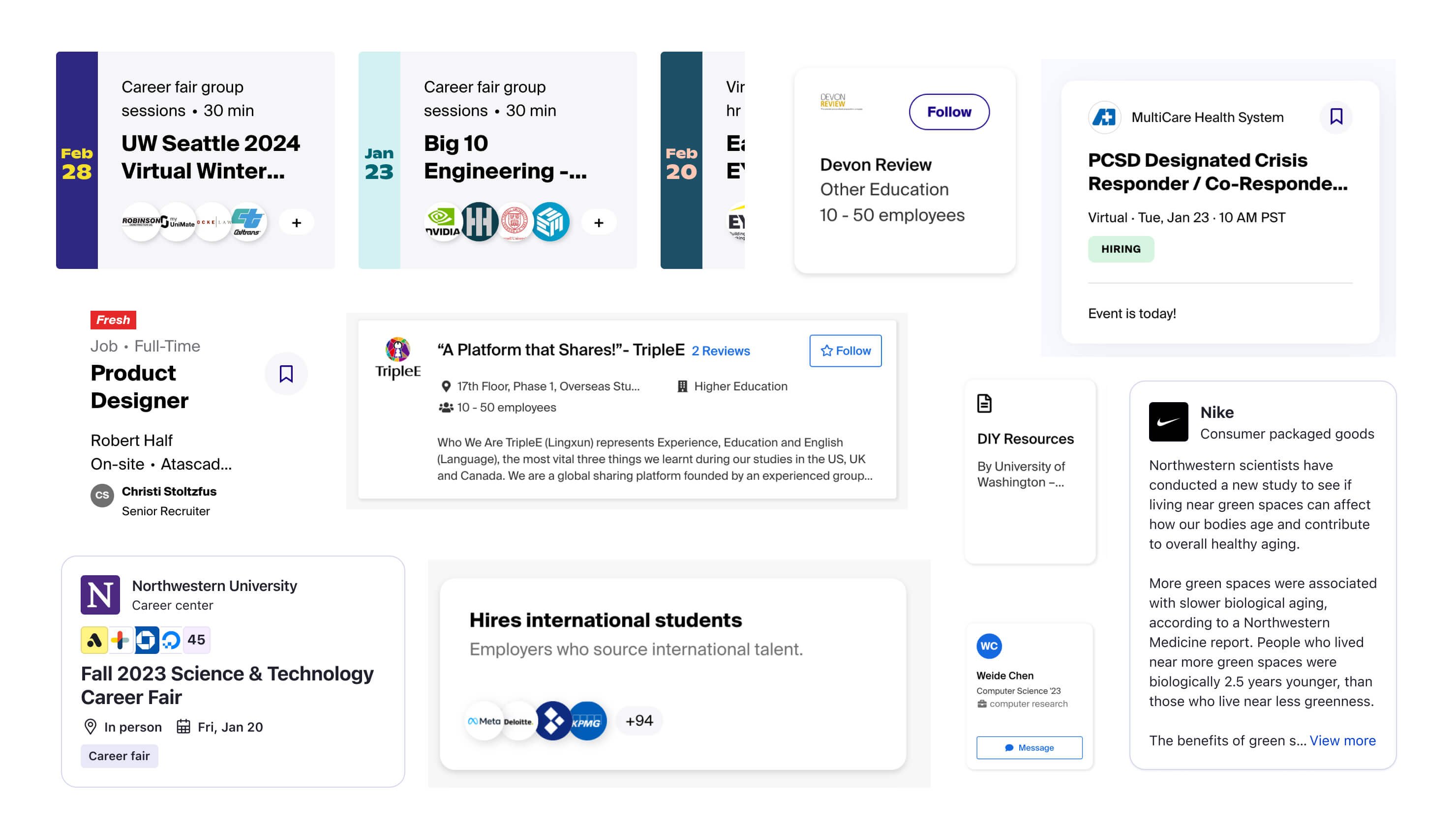
Cross-product card system
Supporting the launch of a new Feed product and making cards better for designers, developers, and end users.
What's more – we had an upcoming product launch for a new social media feed product that would be made almost completely from content cards.
My role
I worked as the design lead to unify our approach to cards into a systematic yet flexible framework, coordinating with 3 different teams of product designers, PMs, and engineers to align on a system proposal and translate it into the live product.
The work
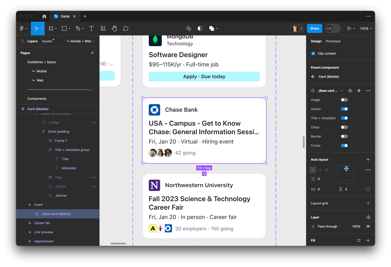
As the lead on Handshake's design systems team, I saw firsthand the wide range of cards being discussed in design reviews and critiques, and proposed a project to come up with a unified system.
I took charge on:
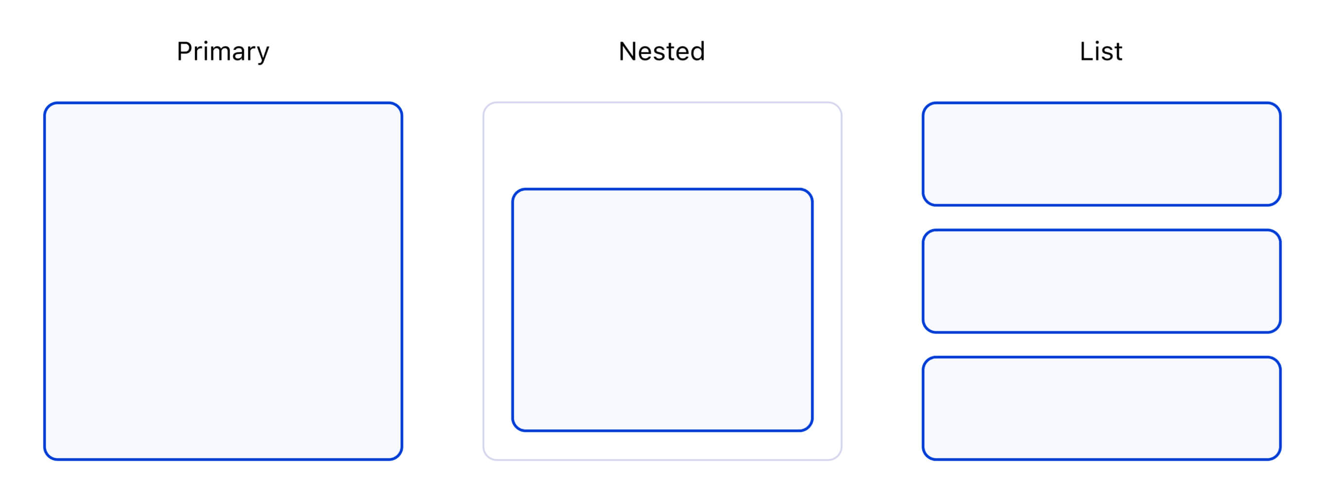
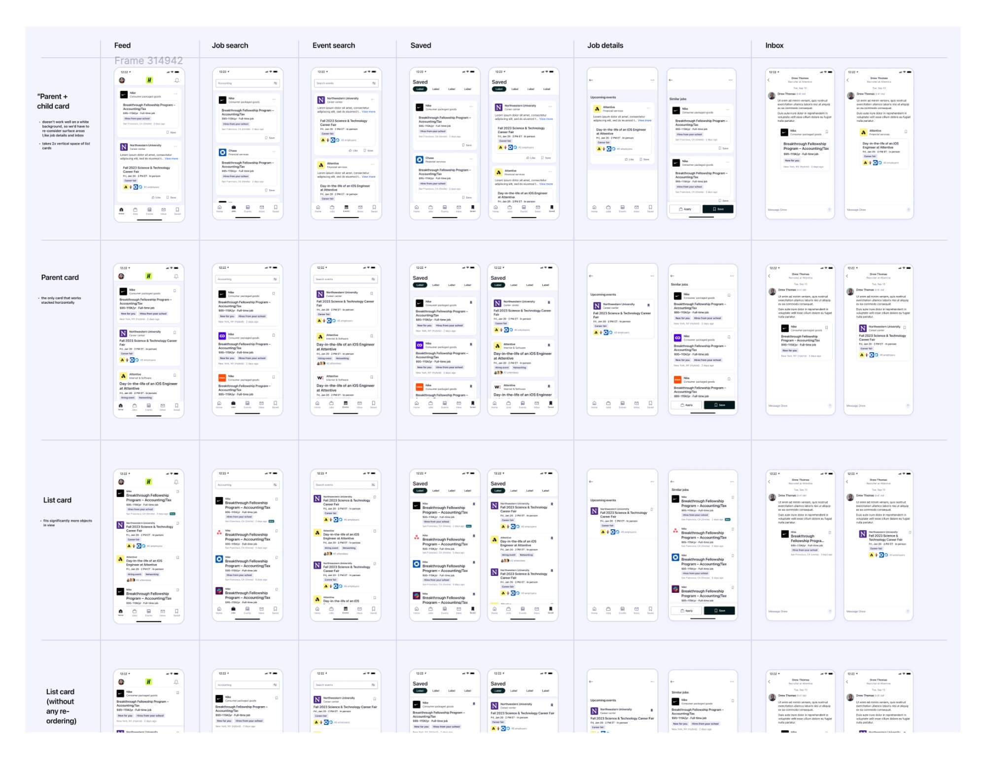
- Auditing our existing cards and competitive examples
- Exploring potential card systems
- Visual and interaction design of the components
- Moving the work through multiple leadership reviews
I built off early card designs that various product designers had explored for their respective product areas, and worked with them to present the work to leadership. I led a series of roadshow presentations with a number of feature teams to get more buy-in for the system.
The outcome: simplified decision making, a successful Feed launch, cheaper card implementations, and greater product polish & consistency.
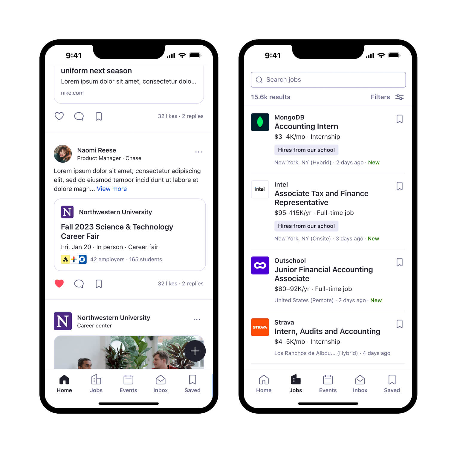
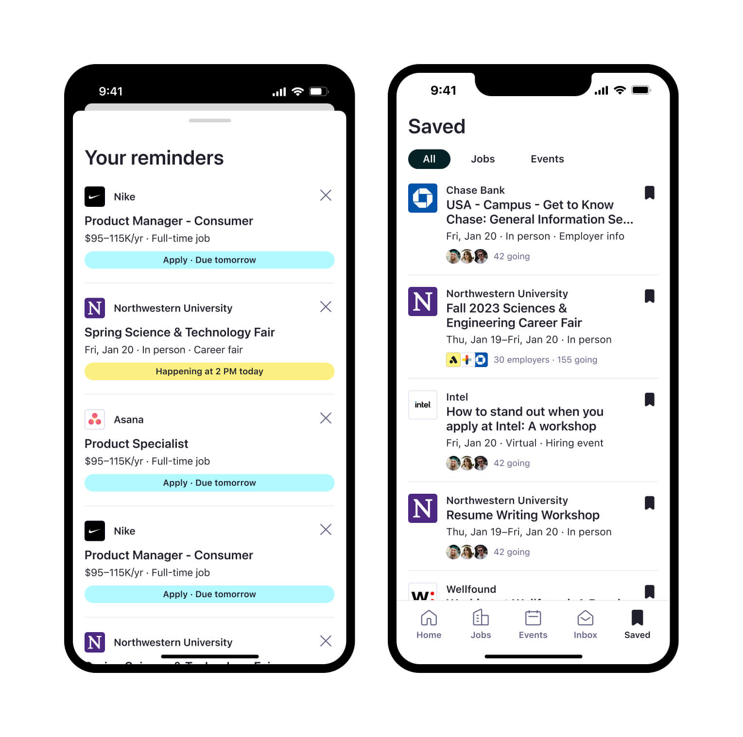
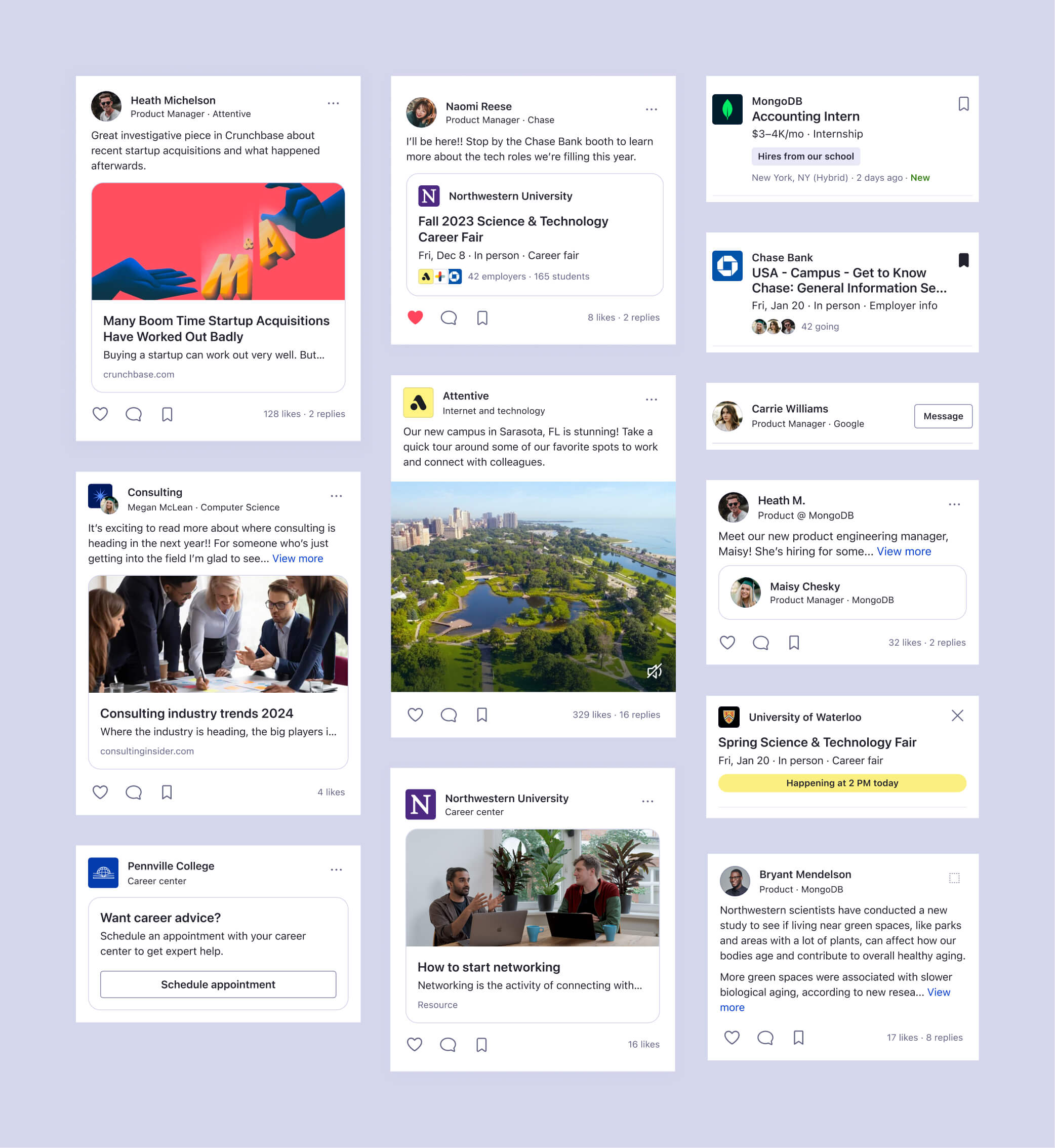
The card system simplifies decision-making when introducing new card variants, and creates reusable components that reduces the time spent during eng implementation. The new cards are in use today across web, iOS, and Android.
These cards were included in the launch of Handshake's Feed product, which bumped our weekly active users by >300% for participating universities, and is scheduled for a wider launch in February 2024.
Now, designers are able to take ready-made components and customize them in ways that match the implementation in code, which significantly reduces the time it takes to implement experiences that require a card component.
The card system is already being extended and flexed into new use cases across our Employer and School products. It speeds up the delivery time significantly for a card by providing a plug-and-play framework for designers and developers.
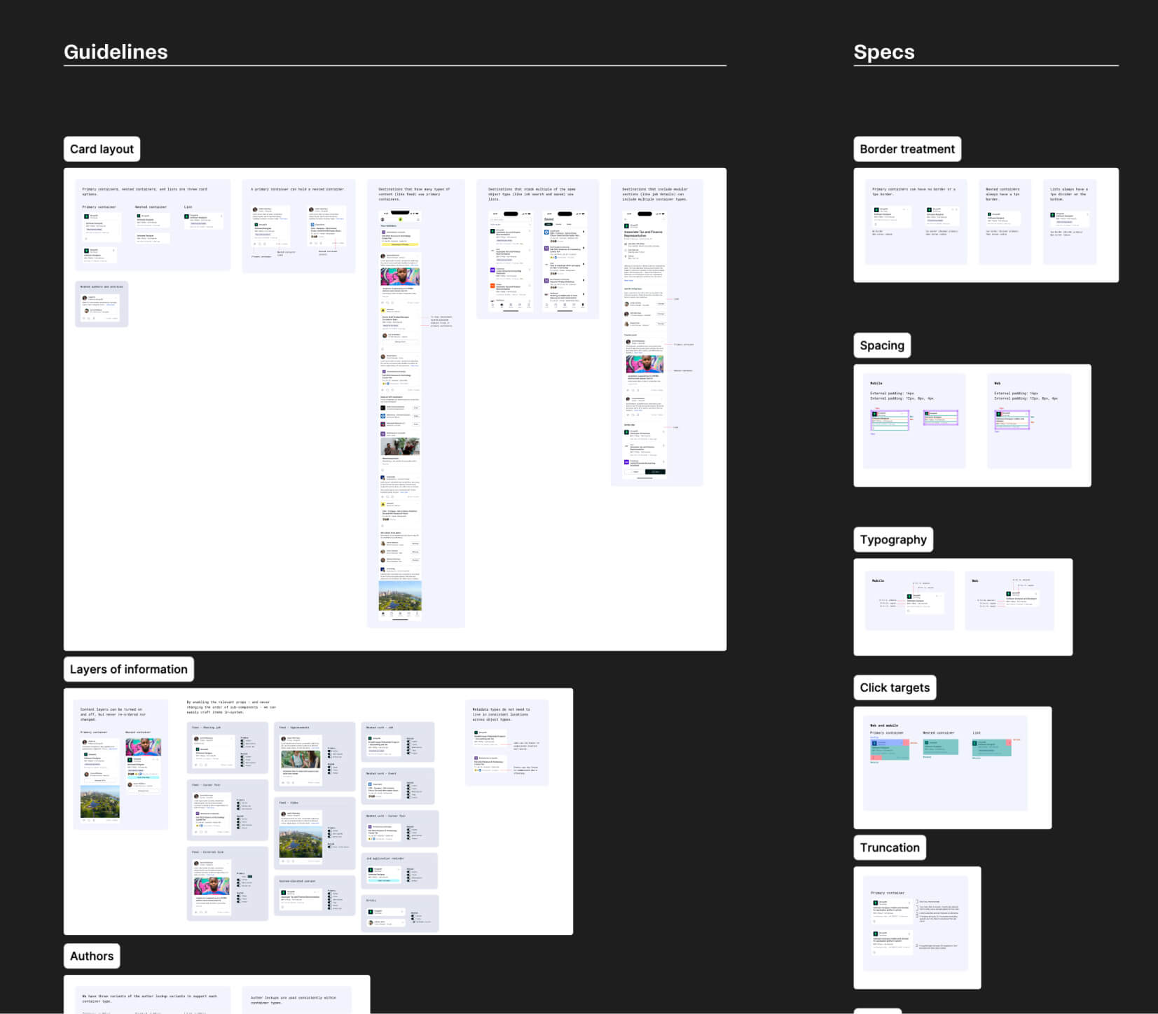
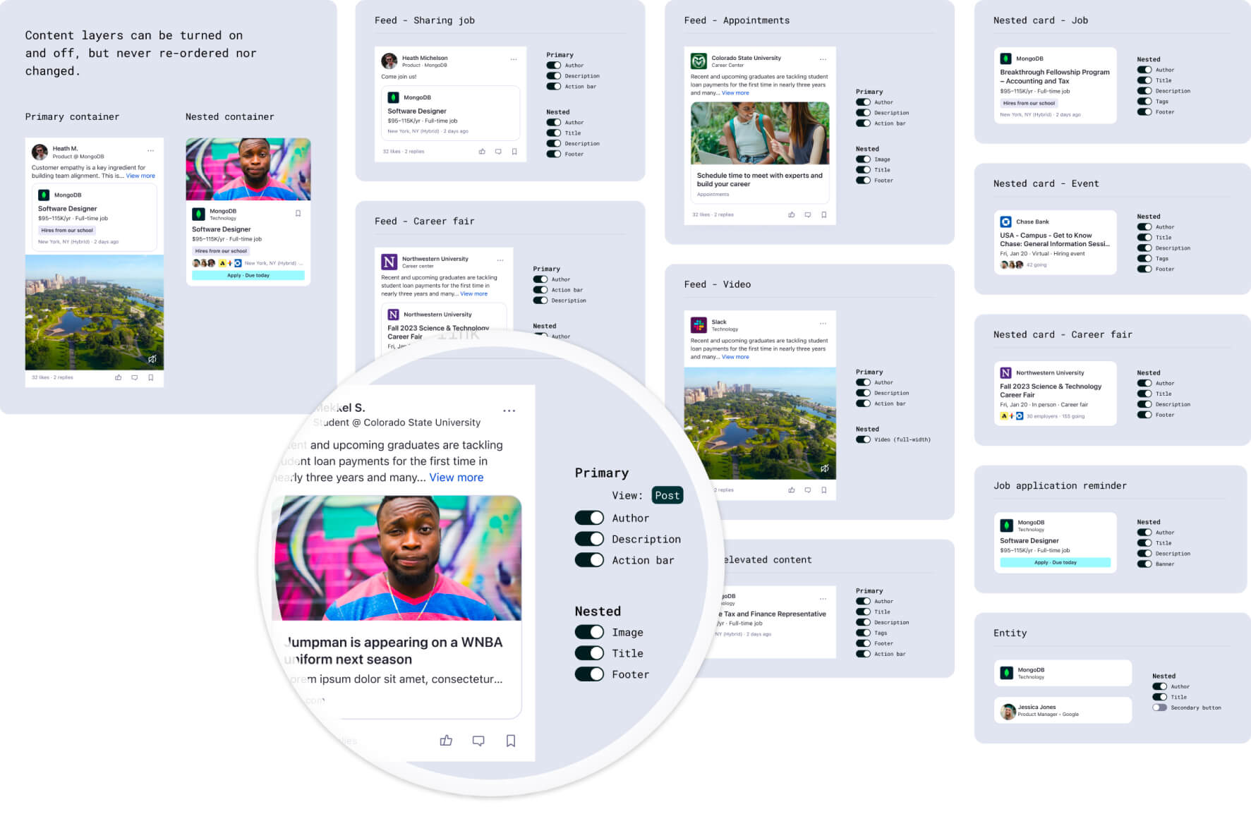
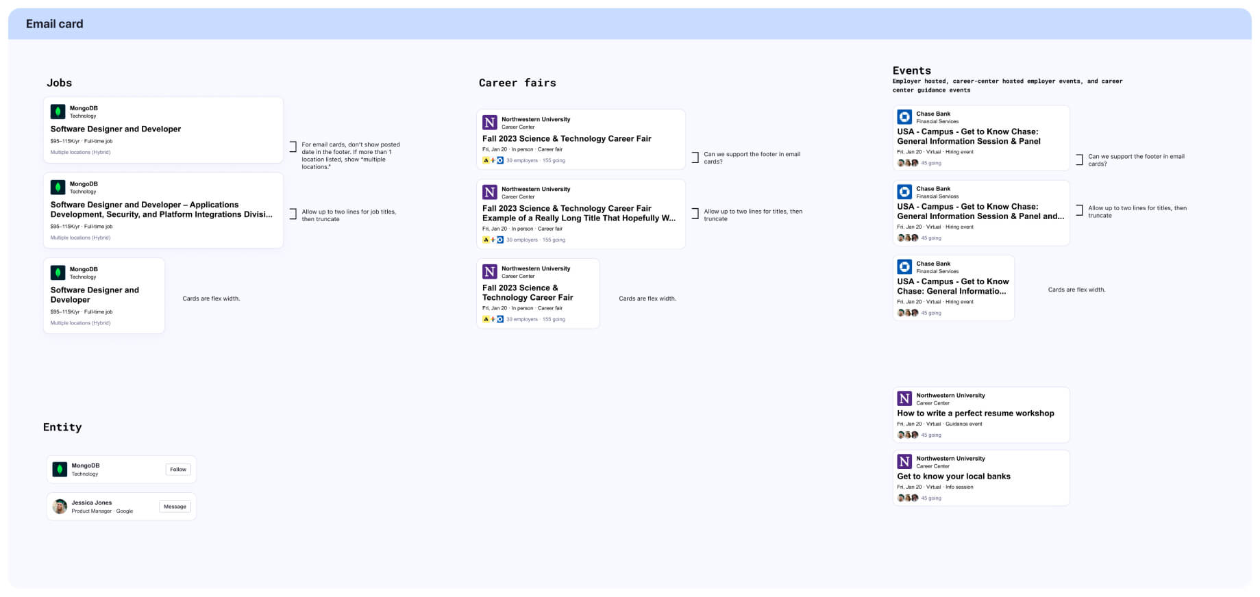
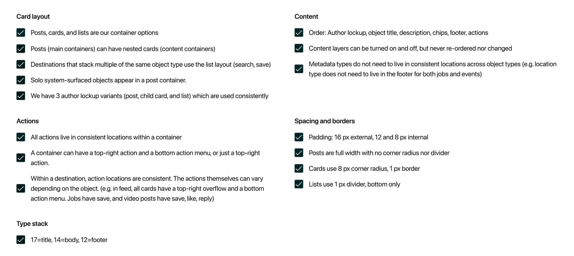
Process artifacts
I took a rigorous approach to auditing our existing cards, exploring potential directions, and aligning on a proposal with feature teams and design & engineering leadership. I’m happy to discuss my process in more detail in a conversation–these are just some snippets of artifacts from the design process.
Want to learn more?
I'd be delighted to walk through the designs and process in more detail in a portfolio review or conversation.