Handshake2023
Reimaginingjobsearchandcareerdiscovery
Handshake is primarily known as a jobs board, but its jobs experience was slowly falling behind the competition.
The job search experience lacked much of the polish and completeness expected of a consumer-grade product. What’s more: there was no coherent, long-term roadmap of improvements to prioritize work against.
My role & impact
As design lead, I spent two months exploring new futures for Handshake’s job search experience, ultimately using the work to align our product team and leadership on multiple quarters worth of new projects. Below are a few of the feature proposals that resulted from the work.
Job alerts: get the jump on new job postings
Competitive analysis and interviews with students quickly revealed that our lack of a saved search / job alert experience made it more difficult to find fresh jobs.
Job alerts give students a one-tap solution to staying on top of new jobs that meet their specific search criteria. They can combine keyword searches and filters, and be configured to send daily or weekly via email and push notification.
Core search and type-ahead
Surprisingly, our job search experience lacked any semblance of type-ahead features, likely contributing to the very low conversion rate to job saves and applies from keyword searches. A lack of help from Handshake left students with no idea how rich our inventory of jobs was, since they had to guess as to what they might be able to search for.
One of my proposals was to introduce type-ahead, which has now been launched — and increased job saves after keyword searches by 122%.
Upgraded filtering experience
It was clear from research that our filters weren’t cutting it: students were overwhelmed by the choices and couldn’t find basic filters like pay — because they didn’t exist.
Updating our filtering experience was table stakes for an improved job search. I referenced usage data to cut down the ones we didn’t need, and interview and survey insights to propose new additions.
The team has used the concepts to iteratively improve filtering; pay, company size, and collections filters have been added, and a number of others removed. Pay has been the most popular filter, leading to a 56% increase in applied filters and a 9% increase in jobs saved by students.
Jobs and career discovery
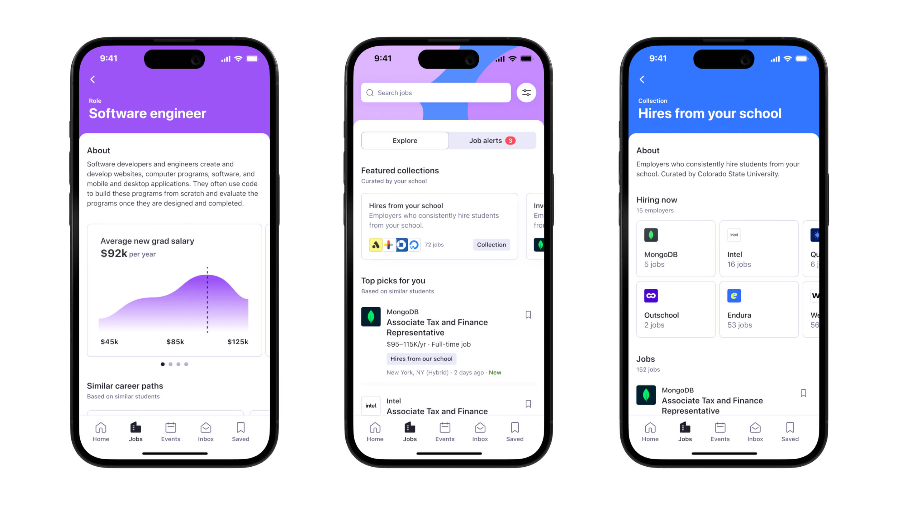
From left to right: career path explorer, discovery landing page, collections.
Key insights from user research and usage data told us that students just weren’t interacting with keyword searches or filters — they preferred to scroll and see what the algorithm found for them because the student population is particularly unsure of what jobs they should be looking for.
With this in mind, I proposed a suite of discovery-related features to give students a more curated, personalized feed-like experience within job search.
Of the features, school-picked collections has launched, leading to an 18% increase in job saves and a 155% increase in job impressions.
Match batch
Match batch was one of the concepts I created to make Handshake’s jobs platform more sticky, by re-engaging students once a week with fresh batches of recommendations delivered Tinder-style. While this experience was deprioritized in favor of other projects, it tested well with students and is one of my personal favorites.
Where we started
At the outset of this work, the live experience used a different visual language — Handshake was just beginning to transition to an updated design system. I was one of the early adopters of the new system and used the project to explore how it applied to real product scenarios.
Process
I produced a large volume of exploratory design work, collaborated with a user researcher to run discovery research and concept validation, and worked closely with my PM to align on the overall strategy.
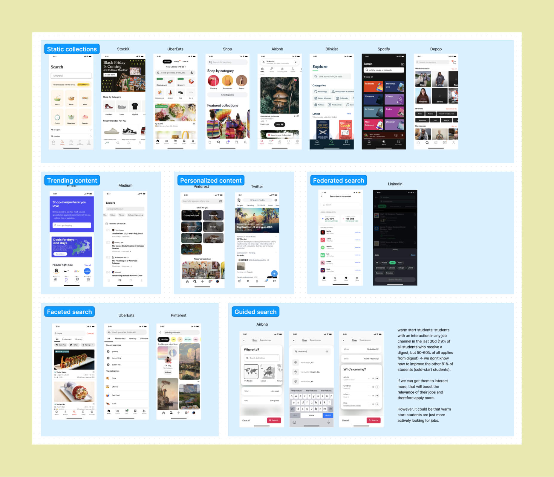
Research and competitive auditing
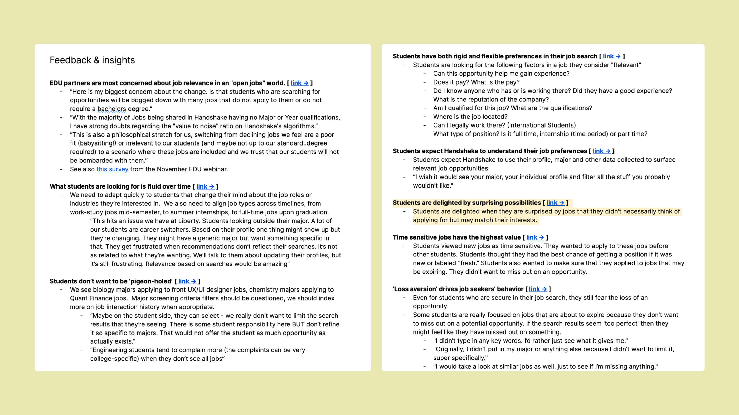
I start every project with a thorough review of available research and data and a survey of the competitive landscape. I reviewed research from the last three years to pull out everything relevant to job search, and worked with the data team to orient the team to the state of job search.
Cross-functional brainstorm
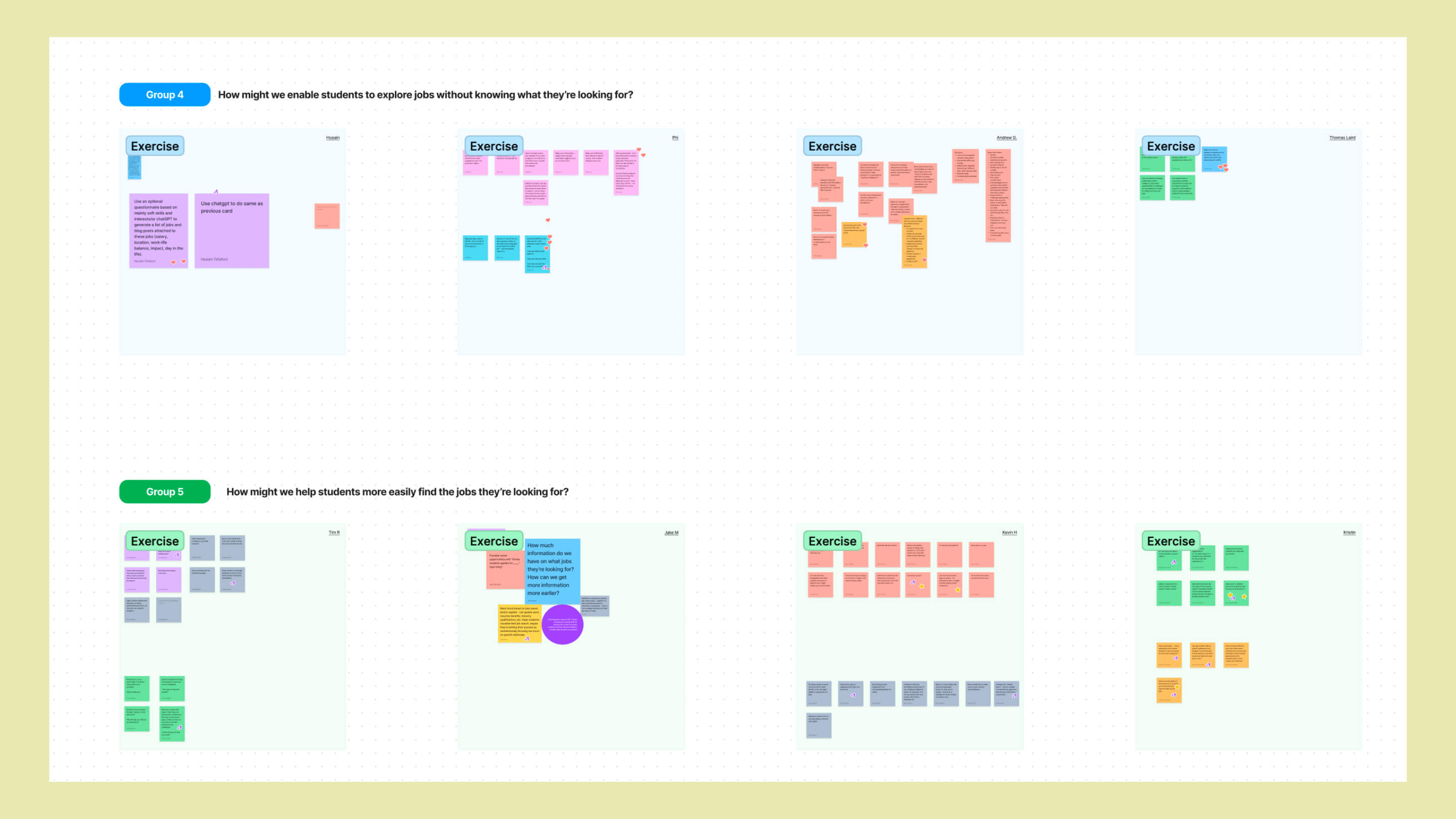
The project lined up with a pre-planned jobs team onsite in San Francisco — about 50 members from engineering, design, data, and product. Although I couldn’t attend in person, I remotely led a collaborative brainstorm that served as a heads-up on the project and generated a ton of ideas and challenges to consider, centered around how might we statements from the research phase.
Synthesizing and exploring
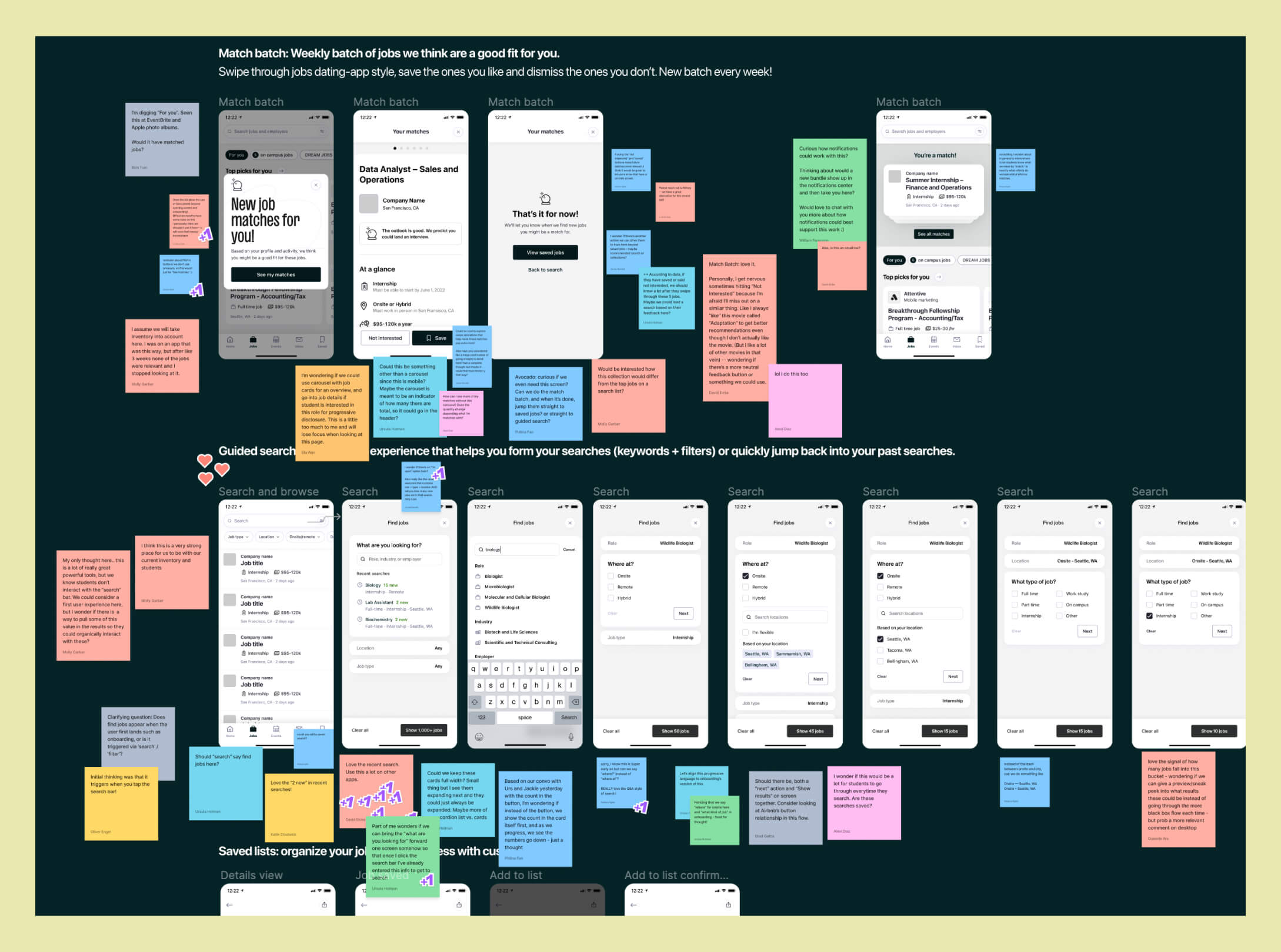
After the workshop, I synthesized key themes and top ideas and started translating them into rough visualizations. A series of design crits and jobs team shareouts helped refine ideas and decide which ones to pursue further.
Concept testing
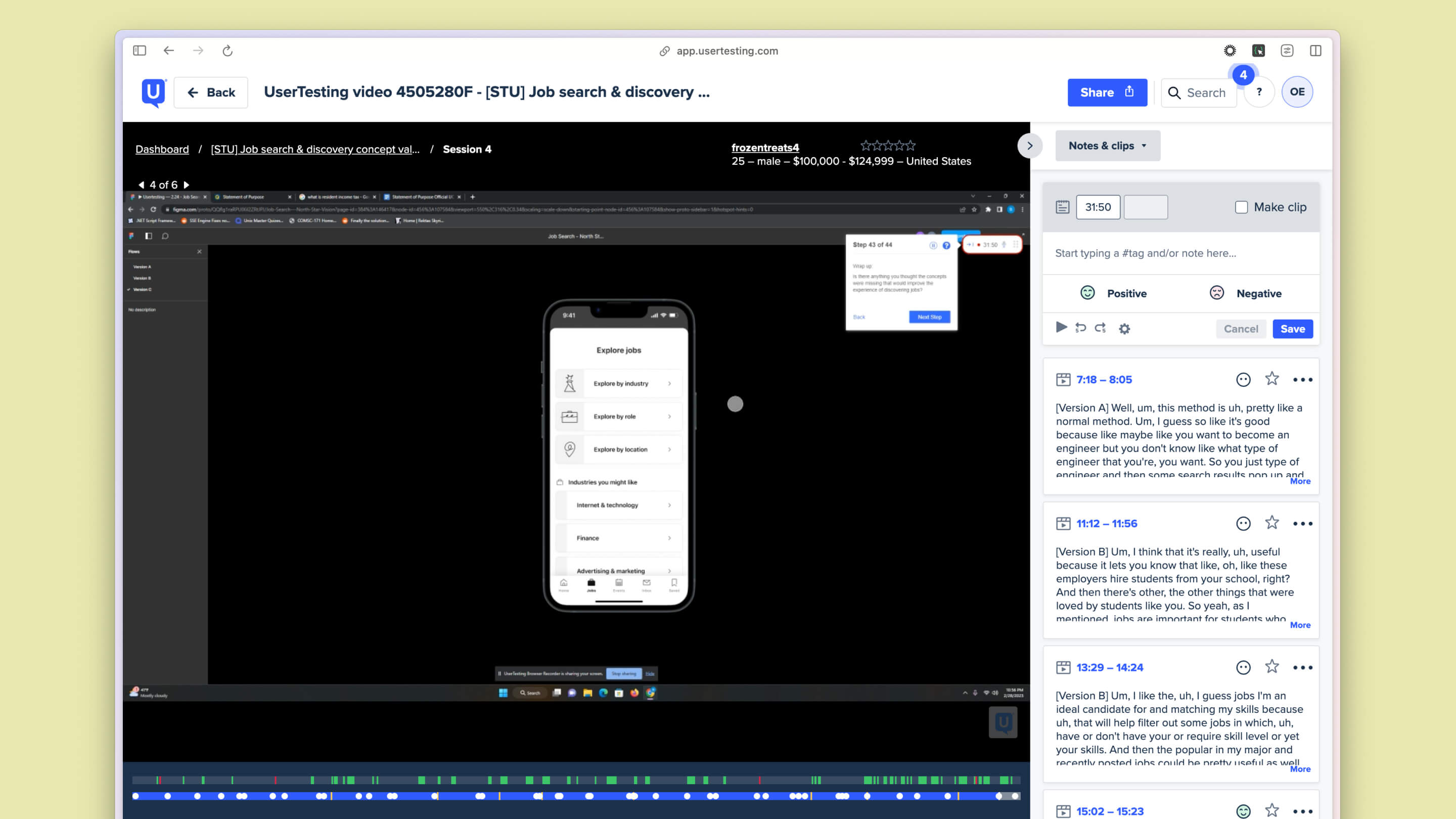
I worked with a user researcher to run quick concept test and iteration cycles, tweaking the concepts each time they were shown. Testing helped refine some ideas, archive others, and generate new ideas entirely. We used a mix of sync and async testing sessions to move quickly.
Cohesive vision prototype
The suite of feature ideas needed to be demonstrated in a seamless experience in order to have sway with leadership. I combined a mix of near-future to further-out ideas into a single wireframed prototype and continuously workshopped it with my team to make the case for the overall vision.
Roadmap and execution
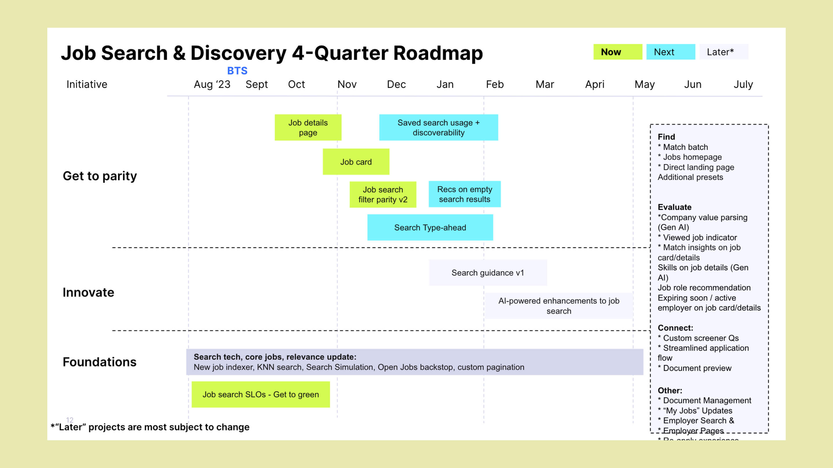
A number of projects were added to the roadmap for following quarters: search typeahead and autosuggest (now launched), saved searches and job alerts (now launched), redesigned search filters (partially launched), skip to application, and a redesigned job details page.
Another set of projects were deemed later work that is promising but needs more investigation: match batch job matching, guided job role and career path exploration, and a discovery landing experience.
Interested in learning more about this project?
This is just a part of this project and the process behind it. I’m happy to share more about it in a conversation or portfolio presentation.
Email copied!